
This guide is designed to take you from staring at raw data to building your own interactive dashboards in Power BI. We’ll walk through everything, step-by-step: connecting to your data, cleaning it up in Power Query, building a solid data model, and finally, creating visualisations that tell a clear story.
Your Starting Point with Power BI
If you’ve ever found yourself lost in a massive spreadsheet, trying to pinpoint a trend or pull out a key piece of information, you’re not alone. It’s a huge challenge for most businesses. This guide is your way out of that maze of static rows and columns and into the world of dynamic, interactive data with Microsoft Power BI. For UK businesses, it’s a genuine game-changer for making smarter decisions, faster.
Before we jump into the practical side of things, it’s worth getting a handle on the main components and what makes this tool so powerful. We’ll be using a sample UK-based sales dataset throughout, so you can see how these concepts apply to a real-world business scenario.
Understanding the Power BI Ecosystem
Power BI isn’t a single piece of software; it’s more like a collection of tools that work together seamlessly to get your reports built, published, and shared.
You’ll mainly be working with three core parts:
- Power BI Desktop: Think of this as your design studio. It’s a free application you download to your computer where all the magic happens—connecting to data, tidying it up, creating relationships, and designing your reports.
- Power BI Service: This is the cloud-based hub where your reports live once they’re finished. You publish them from the Desktop to the Service to create dashboards and share them securely with your team.
- Power BI Mobile: As the name suggests, these are the apps for your phone and tablet. They give you and your colleagues access to your reports anytime, anywhere, so insights are always at your fingertips.
This typical workflow—from creation to consumption—is a really smooth process. You build everything locally, share it via the cloud, and then anyone with permission can access it on any device.
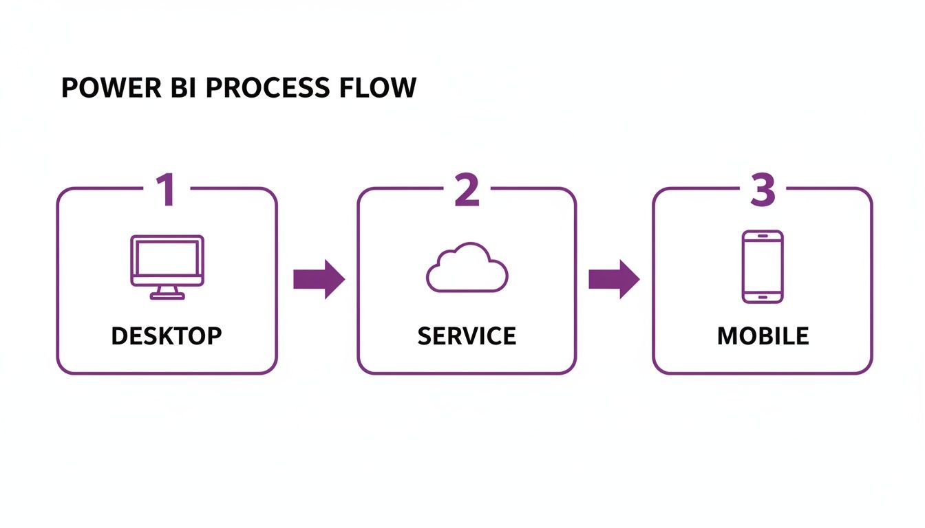
This flow from Desktop to Service to Mobile ensures that once you’ve done the hard work of building a report, distributing it securely is straightforward.
To make it even clearer, here’s a quick breakdown of the core tools and what they’re used for.
The Power BI Ecosystem at a Glance
| Component | Primary Use | Best For |
|---|---|---|
| Power BI Desktop | Report authoring and data modelling | Creating reports from scratch, transforming data, and defining calculations. |
| Power BI Service | Sharing, collaboration, and dashboards | Publishing reports for your team, building high-level dashboards, and managing access. |
| Power BI Mobile | On-the-go report viewing | Accessing and interacting with reports and dashboards away from your desk. |
This structure lets developers build in a controlled environment (Desktop) before sharing the finished product with a wider audience (Service and Mobile).
Why UK Businesses Are Adopting Power BI
The move towards data-driven decision-making isn't just a buzzword; it's a reality. Here in the UK, businesses are increasingly turning to Power BI to find efficiencies and unlock new opportunities. In fact, a staggering 58% of organisations plan to prioritise greater adoption of the tool in 2025. It’s becoming an essential part of the modern business toolkit.
Power BI gives you the ability to stop guessing and start knowing. It takes your complex sales, finance, or operational data and turns it into clear, visual stories that help you spot trends you’d almost certainly miss otherwise.
Learning a tool like this is a fantastic career move. If you're just starting out, taking a look at a complete roadmap to becoming a data analyst can give you a brilliant overview of the skills you'll need. Power BI is a cornerstone of that journey.
For a deeper dive into how different departments can benefit, have a look at our article on what Power BI is used for.
Installing Power BI and Connecting Your Data
Right, let's get our hands dirty. The first real step on your Power BI journey is getting the software installed. This is where you leave static spreadsheets behind and start building genuinely interactive dashboards. We'll be installing Power BI Desktop, the free application where all the magic happens – building reports, shaping your data, and creating your data model.
Getting Power BI Desktop
First things first, you need to download Power BI Desktop. The good news? It's completely free. You can grab it directly from Microsoft's website, but I usually recommend getting it from the Microsoft Store on Windows.
Why the Store? It just makes life easier. The Store version updates itself automatically in the background, so you’ll always have the latest features and security fixes without having to think about it.
Once it's installed and you open it up, you'll see the main canvas. It can feel a little overwhelming at first, but it's logically laid out. On the left, you have three key views you'll switch between constantly: Report View (for your visuals), Data View (to peek at the raw data in your tables), and Model View (to link your tables together). To the right, you’ll find the Fields and Visualisations panes – these are your main building blocks for any report.

This free tool gives you everything you need to create incredibly sophisticated reports before you even think about sharing them.
Connecting to Your First Data Sources
With Power BI Desktop running, it's time to feed it some data. This is where Power BI truly shines. Its ability to connect to hundreds of different data sources—from a simple Excel file on your desktop to enterprise-level databases and cloud services—is phenomenal. This connectivity is a cornerstone of the wider Microsoft Power Platform.
Let's walk through connecting to a few data sources that most UK businesses rely on.
-
Excel Workbook: This is the bread and butter for so many analyses. From the 'Home' ribbon, just click
Get Data > Excel Workbookand find your file. Power BI is smart enough to show you every sheet and named table inside, so you can pick exactly what you need. -
SQL Server Database: If your business data lives in a proper database, you'll select
Get Data > SQL Server. You'll need the server address and maybe the database name. The important choice here is whether to Import the data (which takes a snapshot into your Power BI file) or use DirectQuery (which queries the database live with every click). -
Web Source: You can even pull data straight off a website. Choose
Get Data > Web, pop in the URL, and Power BI will scan the page for any HTML tables it can recognise. It's surprisingly effective for grabbing public data.
Understanding the Costs
Let's clear up the money question straight away, as it often causes confusion.
Power BI Desktop is 100% free. You can download it, connect to data, and build fully interactive, complex reports without paying a single penny. The costs only kick in when you want to share and collaborate.
To publish your reports and share them securely with colleagues, you'll need a Power BI Pro licence. This is a per-user subscription, which currently costs around £8.20 per user, per month in the UK. This licence is your ticket to the Power BI Service (the cloud part of the tool) where you can collaborate in shared workspaces.
Of course, a business often has data in multiple places. If you find yourself needing to connect to a PostgreSQL database or another system, the process is very similar.
Now that we have the software and we've pulled in some data, we can move on to the most crucial part of the process: cleaning and preparing that data for analysis.
Transforming Raw Data with Power Query
Right, you’ve pulled your data into Power BI. What’s next? This is where the real magic begins, and honestly, it’s the most critical step: data transformation. Let's be realistic, raw business data is almost never clean. It's often messy, riddled with inconsistencies, missing values, and columns you just don't need.
This is where you'll get very familiar with the Power Query Editor. Think of it as your data workshop. It’s a powerful tool built right into Power BI that lets you clean, shape, and mould your data until it’s in perfect condition for analysis.

The best part? Every single cleaning step you perform—every filter, every removed column, every renamed header—is recorded. When you refresh your data tomorrow, or next week, Power Query automatically repeats those same steps for you. This turns your report from a one-off task into a reliable, automated source of insight. It’s a huge time-saver.
Essential Data Cleaning and Preparation Steps
When you first connect to a data source and click 'Transform Data', you’ll be taken into the Power Query Editor. It opens in a new window, and at first glance, the ribbon full of options can feel a bit intimidating. Don't worry, you'll mostly be using a handful of them to start.
Let’s use our sample UK sales data to walk through the absolute must-do transformations. Getting these fundamentals right is non-negotiable for building a solid report.
-
Removing Unneeded Columns: Your source file probably has columns you don’t care about for your analysis. To keep your data model lean and fast, just select them, right-click, and hit 'Remove'. Simple.
-
Changing Data Types: Power BI does a decent job of guessing data types, but it's not perfect. You absolutely have to double-check that your numbers are numbers, text is text, and—most importantly—dates are actually dates. An incorrect data type here can cause absolute chaos later with your calculations and visuals.
-
Filtering Out Irrelevant Rows: Maybe you only need to analyse sales from the last two years or from a specific region. Just like in Excel, you can use the filter buttons on each column header to chop out any rows that aren't relevant to your report.
-
Handling Errors and Blanks: Blank cells (or 'nulls') and errors can break your visuals. A common fix is to right-click the column and use 'Replace Values' or 'Replace Errors'. You could swap a null in a sales column for a zero, for instance.
Practical Transformations for Business Data
Once the basic tidying is done, Power Query has some incredibly powerful tools to reshape your data for better analysis. This is where you can start creating new, valuable information from what you already have.
For example, our UK sales data might have a 'Full Name' column for customers. That’s okay, but splitting it into 'First Name' and 'Last Name' is far more useful for things like personalisation.
This is surprisingly easy to do. Select the column, head over to the 'Transform' tab, and click 'Split Column'. You can split by a delimiter—in this case, a space—and Power Query will instantly create two new columns for you. That simple action makes your data far more flexible.
Another classic business scenario is creating new columns from existing ones. Let's say you have 'Sales Amount' and 'Cost of Goods Sold' columns, but you're missing 'Profit'. You don't need to wait and write a complicated DAX formula later on. You can create it right here.
- Jump to the 'Add Column' tab in the ribbon.
- Choose 'Custom Column', which opens a simple formula editor.
- Type in a straightforward formula like
[Sales Amount] - [Cost of Goods Sold]. - Give your new column a name, like 'Profit', and click OK.
By doing this calculation in Power Query, you push the heavy lifting to the data prep stage, which is a best practice for keeping your report running smoothly. Mastering these transformations is how you turn a messy data dump into a clean, powerful foundation for building genuinely useful reports.
Building Your First Data Model with DAX
Once you’ve wrestled your data into shape with Power Query, you're ready to step into Power BI’s analytical engine: the data model. This is where you move beyond flat tables and start building a connected, logical structure. Think of it as giving your report a brain, teaching it how all the different parts of your business information relate to one another.
The whole process is surprisingly intuitive. By simply connecting your tables, you unlock the ability to analyse data across your entire business, not just within separate, isolated silos. Getting this right is probably the most important concept for any beginner, as it’s the foundation for every single insight you’ll uncover later.
Why Data Modelling Is So Important
Let's imagine you have a 'Sales' table packed with transaction details and another table for 'Products' with all your product information. Left on their own, Power BI has no idea that the 'Product ID' in your sales data has anything to do with the 'Product ID' in your product list. They’re just two disconnected columns of numbers.
Creating a relationship between them is like telling Power BI, "Hey, see this column? It’s the same as that column over there." You literally just drag the 'Product ID' column from one table and drop it onto the 'Product ID' in the other.
As soon as that link is made, you can instantly start filtering sales by product category or see sales totals for a specific product name, even though that information lives in a completely different table.
This simple act of connecting tables is what separates true business intelligence from basic spreadsheet work. It allows you to build a single, unified view of your operations, where every piece of data gives context to another.
For East Midlands organisations that have worked with F1Group since 1995, we've seen first-hand how this unlocks serious business potential. In fact, a 2025 UK-specific survey found that a notable 62% of firms using combined AI and BI analytics, like Power BI, gain significant competitive advantages and operational efficiencies. You can learn more about these findings on AI and BI analytics in the UK.
Your First Taste of DAX
With your model properly structured, it’s time to start creating your own calculations. This is where DAX (Data Analysis Expressions) enters the picture. DAX is the formula language you'll use throughout Power BI. If you’ve ever written a formula in Excel, you’ll find it feels familiar, but you'll quickly realise it's a whole lot more powerful.
DAX lets you create two main types of calculations:
- Calculated Columns: This adds a brand-new column to one of your tables, with the value calculated for every single row when your data is refreshed. They are best for static, descriptive values you might want to filter by, like creating a 'Price Band' column based on a product's price.
- Measures: This is where the real magic happens. A measure is a dynamic calculation that's performed on the fly, responding directly to the context of your report. For example, a 'Total Sales' measure will give you a different result depending on whether you're looking at it by year, by region, or by a single product.
As a beginner, you'll almost always want to create measures, not calculated columns, for your core business metrics.
Creating Your First DAX Measures
Let's get our hands dirty and build a few essential measures using our UK sales dataset. These are the bread-and-butter calculations nearly every business relies on, and they make for a perfect introduction to writing DAX.
To get started, right-click on your 'Sales' table in the Fields pane and select 'New measure'. This will pop open the formula bar at the top of the screen.
Example 1: Calculating Total Sales
This is often the very first measure anyone creates. The formula is incredibly straightforward and uses one of the most common DAX functions, SUM.
Total Sales = SUM('Sales'[Sales Amount])
This formula simply tells Power BI to add up every value in the 'Sales Amount' column of the 'Sales' table. The beauty of this measure is its flexibility; it will automatically recalculate for any filter you apply in your report.
Example 2: Calculating Average Transaction Value
Next up, let’s figure out the average value of each transaction. For this, we’ll use the AVERAGE function.
Average Transaction Value = AVERAGE('Sales'[Sales Amount])
Just like SUM, this measure adapts to its environment. If you add it to a chart showing sales by month, it will calculate the average transaction value for each month individually.
Example 3: Calculating Year-on-Year Growth
This one is a bit more advanced, but it perfectly demonstrates the analytical horsepower DAX gives you. Calculating year-on-year (YoY) growth can be a nightmare in a spreadsheet, but it’s remarkably simple in Power BI thanks to its built-in Time Intelligence functions.
YoY Sales Growth % = DIVIDE( [Total Sales] - CALCULATE([Total Sales], SAMEPERIODLASTYEAR('Calendar'[Date])), CALCULATE([Total Sales], SAMEPERIODLASTYEAR('Calendar'[Date])) )
That formula might look a little intimidating at first glance, but all it’s doing is comparing your 'Total Sales' measure with the 'Total Sales' from the exact same period last year.
The key takeaway? Start with simple measures like 'Total Sales' and gradually build up to more complex ones like this. It's the best way to demystify DAX and bring powerful analytics to your reports without needing a degree in data science.
Ready to take your Power BI skills to the next level or need expert help deploying it in your business? Give us a call on 0845 855 0000 today or Send us a message.
Designing and Publishing Your Interactive Report
Right, we've wrestled with the data and built a solid model. Now for the fun part—turning all that hard work into a report that actually tells a story and gets people curious. This is where we leave the data tables behind and jump onto the report canvas.
We're going to build something more than just a pretty picture. The goal is to create a dynamic tool that your colleagues can genuinely use to dig into the numbers and find answers for themselves.

Choosing the Right Visuals for Maximum Impact
Power BI throws a lot of chart options at you, and it's easy to get carried away. I've seen plenty of beginners pick a visual just because it looks flashy. The golden rule is to always let the question you're asking dictate the chart you use.
Here are the essentials I turn to time and again:
- Bar and Column Charts: These are your bread and butter for comparing things. Use a column chart to see sales across different product categories or a bar chart to rank your top salespeople. They're simple, clear, and effective.
- Line Charts: Nothing beats a line chart for showing how things change over time. Want to see how our 'Total Sales' measure has performed month-on-month? A line chart will reveal trends and seasonal patterns at a glance.
- KPI Cards: When one number is the most important thing on the page, make it shout. KPI cards are perfect for big, headline figures like total revenue or your overall profit margin.
- Maps: If your data has a location—customer postcodes, regional sales offices—a map gives you instant geographical context that a simple table could never provide.
To get your data into a chart, you just drag fields from the Fields pane on the right and drop them into the configuration slots for that visual, like 'Axis', 'Legend', and 'Values'.
Making Your Report Truly Interactive
A static report is a missed opportunity. What makes Power BI so powerful is its interactivity, which allows people to explore the data on their own terms. The main tools for this are slicers and filters.
Think of a slicer as a user-friendly filter right on the report page. For our UK sales data, we could add slicers for 'Year', 'Product Category', and 'Region'. When someone clicks '2023' or 'Electronics', every single chart on the page will instantly update to show only that data.
The real magic happens when you empower your team to explore. It changes the conversation from you presenting static findings to them discovering their own insights. That's how you build a data-driven culture.
Publishing and Sharing Your Work
Once you're happy with how your report looks and feels in Power BI Desktop, it's time to get it into the hands of the people who need it. This means publishing it to the Power BI Service, the cloud-based home for all your reports.
It's straightforward: just hit the 'Publish' button on the Home ribbon. You'll be asked to pick a workspace in the Power BI Service, and once it's uploaded, you can access it from any web browser.
From there, you've got a few ways to share it:
- Share a direct link: Send a URL to specific people, controlling whether they can just view it or share it further.
- Grant workspace access: Add your team members to the workspace itself, letting them see everything in that project.
- Create an App: For wider distribution, you can bundle related reports and dashboards into a single, polished 'App' for your whole company to use.
Getting the report built is only half the job; getting people to actually use it is what delivers the value. It’s sobering to know that only 16% of organisations see full dashboard adoption globally. Yet, the 52% of UK leaders who get a return on their investment in under a year are the ones who focus on user training. You can learn more about the pitfalls to avoid in this piece on common Power BI mistakes that kill adoption.
To get expert help with designing, publishing, or driving adoption for your Power BI reports, Phone 0845 855 0000 today or Send us a message.
What’s Next? From First Report to Lasting Value
Fantastic work! You’ve built and published your first Power BI report. That’s a huge achievement and the first major step. But the real journey begins now. Once a report goes live, the game shifts to keeping it relevant, accurate, and trustworthy.
The first thing you’ll want to do is make sure your data isn’t stale. Head into the Power BI Service and set up a scheduled refresh for your dataset. This little feature is a game-changer, automatically pulling in the latest data for you. You can set it to run daily, weekly, or even multiple times a day—whatever your business rhythm dictates. No more manual updates.
Scaling Up Without the Chaos
As Power BI catches on in your organisation (and it will!), you need a game plan. This is where data governance comes in, and it's not as scary as it sounds. It’s simply about setting some ground rules:
- Who gets to see what data?
- How do we check a new report is accurate before it's shared?
- Where do we organise our projects? (Hint: Use shared workspaces).
A bit of structure now will save you from a world of pain later. Without a clear governance plan, you’ll end up with conflicting reports, duplicated work, and a general lack of trust in the data. It’s the fastest way to derail your BI efforts.
For businesses here in the East Midlands ready to take their data strategy seriously, F1 Group is here to help. Our managed IT services go beyond the basics, covering everything from high-level Power BI strategy and building custom visuals to the day-to-day maintenance that keeps everything running smoothly. See what a dedicated business intelligence consultant can do for you.
Let us worry about the technical side of things. You just focus on the insights that will push your business forward.
Ready to talk? Give us a call on 0845 855 0000 or Send us a message.
Your Top Power BI Questions, Answered
As you get started on your Power BI journey, a few questions always seem to pop up. Let's tackle some of the most common ones I hear from people new to the platform.
So, Is Power BI Genuinely Free?
Yes, for the most part. The core tool, Power BI Desktop, is completely free. You can download it, connect to all your data, build complex reports, and analyse to your heart's content without ever paying a penny. It's incredibly powerful right out of the box.
The cost only comes into play when you want to start sharing and collaborating with others. For that, you'll need to publish your reports to the Power BI Service, which requires a Power BI Pro licence. In the UK, this typically runs at about £8.20 per user, per month. There are also Premium options for larger businesses with more advanced needs.
How Is This Different from Just Using Excel?
That's a great question, and one I get asked all the time. While they're both from Microsoft, they are fundamentally different tools designed for different jobs.
Think of Excel as a master of detail—it's fantastic for ad-hoc analysis, creating tables of data, and performing complex, one-off calculations. Power BI, however, is built for business intelligence at scale. It can handle millions of rows of data without breaking a sweat and is designed specifically for creating interactive, visual dashboards that automatically refresh.
My rule of thumb is this: Excel is your high-powered calculator for specific tasks. Power BI is the automated dashboard for the health of your entire business.
Do I Need to Be a Tech Whiz to Use Power BI?
Absolutely not. One of the best things about Power BI is that it was built for business users, not just IT specialists. The drag-and-drop interface for creating visuals means you can build incredibly useful reports without writing a single line of code.
Sure, as you get more advanced, you can dive into the powerful DAX formula language to create sophisticated calculations. But everything we've covered in this guide is designed to get you producing valuable insights from day one, no coding required. You can go a very, very long way with just the basics.
Ready to take your business data to the next level? The expert team at F1Group can help you implement, manage, and get the most from Power BI.
Phone 0845 855 0000 today or Send us a message to find out more.