
Before you even think about opening Power BI, the real work begins. It’s tempting to jump straight into dragging and dropping data, but an impactful dashboard isn’t built on flashy charts. It’s a strategic tool designed to give people clear, actionable answers.
From my experience, rushing into development without a solid plan is the number one reason dashboards fail. It leads to endless rework, frustration, and a final product that just doesn’t hit the mark. Getting this foundation right ensures your dashboard delivers real business value from day one.
Your Strategic Blueprint Before Building a Single Visual
Think of it this way: you wouldn’t build a house without a blueprint. The same principle applies here. This initial planning phase is all about asking the right questions before you touch a single line of data.

This simple flow is my go-to. Notice how the technical stuff—the data—only comes into play after we’ve figured out the human element: who it’s for and what they need to achieve.
First Things First: Who Is This For?
You have to start by asking, “Who are we building this for?” The information a CEO in Nottingham needs to see is completely different from what a sales manager in Lincoln requires.
A CEO likely wants a high-level, 30,000-foot view of profitability and market share. The sales manager, on the other hand, needs to get right into the weeds of team performance, individual quotas, and pipeline conversion rates.
Really think about their roles and what they’ll do with the information. I find creating simple personas for key users is a brilliant exercise. It stops you from building a generic, one-size-fits-all dashboard that doesn’t really serve anyone properly.
Nailing Down Your Objectives and KPIs
Once you know your audience, you can get crystal clear on the dashboard’s purpose. What specific decisions will this report help them make? Which Key Performance Indicators (KPIs) actually matter for those decisions?
It’s easy to fall into the trap of throwing every metric you have onto the page. Don’t. A cluttered dashboard is an ignored dashboard.
Instead, focus on a handful of primary KPIs that tie directly to business goals. For instance, if your objective is to boost online sales, your dashboard might focus on:
- Conversion Rate
- Average Order Value
- Customer Acquisition Cost
- Website Traffic by Source
This disciplined approach ensures every single visual has a clear job to do.
Get Real About Your Data Sources
Finally, it’s time to figure out where your data actually lives and, crucially, what state it’s in. Is the information you need sitting neatly in a SQL database? Or is it scattered across a dozen different Excel spreadsheets and a cloud service like Microsoft Dynamics 365?
A successful Power BI project is built on a foundation of reliable and accessible data. Vetting your sources early prevents major roadblocks during development and ensures the insights you generate are trustworthy.
The whole point is to turn raw data into actionable insights, and to do it quickly. In the UK, a striking 69% of organisations name faster decision-making as the top benefit they get from BI tools like Power BI. This statistic really hammers home why getting the groundwork right is so important.
To help you get started, this checklist covers the essential questions you should be asking at this stage.
Essential Dashboard Planning Checklist
This checklist is designed to walk you through the critical pre-development stages, ensuring you have a solid foundation before you start building.
| Planning Step | Key Question to Ask | Example for an East Midlands Business |
|---|---|---|
| Audience Definition | Who are the primary and secondary users of this dashboard? | Primary: Sales Director based in Derby. Secondary: Regional sales managers in Leicester and Lincoln. |
| Objective Setting | What single business goal will this dashboard support? | To increase regional sales conversion rates by 15% in the next quarter. |
| KPI Selection | Which 3-5 metrics directly measure progress towards that goal? | Lead-to-Opportunity Rate, Opportunity-to-Win Rate, Average Deal Size, Sales Cycle Length. |
| Data Source Vetting | Where does the data for these KPIs live, and is it reliable? | Sales data is in Dynamics 365. Lead data is in a separate marketing system. We’ll need to join them. |
| User Action Plan | What action should a user take based on what they see? | If a sales manager sees a low conversion rate, they should schedule a pipeline review with their team. |
Working through these steps ensures you’re not just creating charts, but a genuine tool for business improvement. As part of your strategic planning, it’s also worth exploring the wider landscape of leading financial dashboard software solutions to understand what best-in-class looks like.
Right, you’ve got your plan sketched out. Now it’s time to roll up your sleeves and get into the data itself. This is where the real work begins, turning all that raw, messy information into a clean, reliable foundation for your analysis. The engine room for all of this is the Power Query Editor, an incredibly powerful tool built right into Power BI.
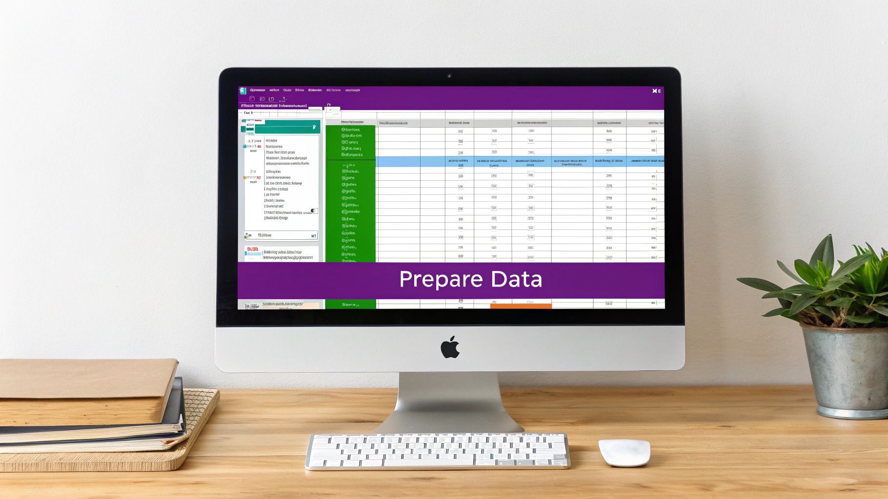
Think of Power Query as your data workshop. It’s where you bring in your raw materials—whether they’re simple Excel files or complex Azure databases—and shape them into something structured and ready for analysis before they ever hit your dashboard.
The truth is, business data is rarely perfect. You’re going to find typos, missing values, the wrong data types, and crucial information scattered across different systems. Power Query is built to fix exactly these kinds of problems, making sure your final dashboard rests on a bedrock of trustworthy data.
Unifying Your Data Sources
First things first, you need to connect to your data. Power BI gives you a massive list of connectors, letting you pull information from hundreds of different places. A really common scenario for a UK business might be pulling sales data from Dynamics 365 and combining it with marketing campaign info sitting in a spreadsheet.
Inside Power Query, you can connect to both of these sources, and they’ll appear as separate queries. This unified view is the starting point for building a cohesive data model where bits of information from different parts of the business can actually talk to each other. Many organisations we work with are surprised by how much valuable data is locked away in tools they use every day, like Excel. To see how to get more from it, take a look at our guide on enhancing Excel with Power BI for finance professionals.
This initial cleanup and connection phase is absolutely critical. For IT managers in East Midlands businesses, getting this right is the difference between a successful Power BI rollout and a failed one. It’s interesting to note that while UK data shows 46% of leaders have set up corporate-wide semantic data layers, a staggering 58% of organisations still see dashboard adoption rates below 25%. That’s a huge gap between preparing the data and getting people to actually use it, a challenge we help businesses solve all the time. You can read more about the research on these common Power BI adoption pitfalls.
Essential Data Transformation Techniques
With your data loaded into the Power Query Editor, you can start the transformation work. The great thing about the interface is that it records every single action you take as an “Applied Step” on the right-hand side. This means every change is repeatable and, crucially, non-destructive. You can always go back and tweak a step without ever touching your original source file.
Here are a few of the must-know transformations you’ll be doing all the time:
- Removing Errors and Blanks: The first order of business is usually to cleanse your data, filtering out rows that have errors or are just empty. This stops calculation problems down the line.
- Changing Data Types: You need to make sure your columns are properly formatted. For instance, if a ‘Date’ column is stored as text, you can’t use it for any time-based analysis. You have to switch it to a proper Date type.
- Splitting Columns: A classic example is having a ‘Full Name’ column. For better analysis, you’ll want to split this into ‘First Name’ and ‘Last Name’ columns.
- Merging Queries: This is how you combine tables. You might merge your sales data with your product details table using a common ‘ProductID’ column to link them.
The real goal here isn’t just about cleaning your data. It’s about shaping it into a structure that’s optimised for performance and easy analysis in Power BI. A well-structured model makes everything that comes next—creating visuals, writing calculations—so much easier.
Ultimately, any time you invest in getting things right in Power Query pays off massively. It automates the entire cleaning process. Every time you hit ‘refresh’ on your report, all those applied steps run again, serving up consistently clean data without you having to lift a finger.
Ready to turn your data into decisions? Phone 0845 855 0000 today or Send us a message to see how we can help.
Building Your Visual Story with DAX and Reports
With your data all cleaned up and perfectly structured, it’s time for the fun part: turning those raw numbers into a compelling visual story. This is where we leave the engine room of Power Query and step into the design studio of Power BI. Here, we’ll create the charts, graphs, and interactive elements that make your data speak to your audience.

Think of this stage as a blend of art and science. It’s about more than just making things look good. You’re choosing the right visual to answer a specific business question and then layering in calculations that let people explore the data for themselves. A static report tells you what happened; a great interactive dashboard helps people figure out why.
Moving Beyond Basic Charts
Power BI has a massive library of visuals, and it’s all too easy to just fall back on the familiar bar and line charts. They have their place, of course, but the real magic of a powerful dashboard lies in matching the visual to the analytical goal. A pie chart might be tempting for showing parts of a whole, but it’s notoriously bad for comparing precise values between categories.
Always start by thinking about the story you’re trying to tell. Are you showing a trend over time? Comparing different teams’ performances? Or maybe trying to understand the distribution of your customer base? Each of these goals has an ideal visual partner.
The most effective dashboards guide the user’s eye and tell a clear story. Selecting the right visual isn’t about making things look pretty; it’s about making the data as easy to understand as possible, instantly.
Choosing the Right Visual for Your Data
Picking the right chart can feel overwhelming at first, but it gets easier when you anchor your choice to what you want to achieve. This quick guide breaks down some common goals and the best Power BI visuals to get the job done.
Choosing the Right Visual for Your Data
| Analytical Goal | Recommended Power BI Visual | Why It Works |
|---|---|---|
| Comparing values between categories | Bar Chart / Column Chart | Excellent for direct, clear comparisons. The length of the bars makes it easy to see which category is largest or smallest. |
| Showing a trend over time | Line Chart / Area Chart | Perfect for tracking performance, like monthly sales or website traffic, showing the highs and lows across a period. |
| Understanding the relationship between two variables | Scatter Plot | Ideal for identifying correlations. For example, plotting marketing spend against sales revenue to see if they are linked. |
| Displaying a single, crucial number | Card / New Card Visual | The best way to highlight a Key Performance Indicator (KPI) like ‘Total Revenue’ or ‘Customer Count’ for immediate impact. |
This isn’t an exhaustive list, but it’s a solid foundation. Once you master these, you can start exploring more advanced visuals like maps, treemaps, and decomposition trees to answer even more complex questions.
Your First Steps with DAX Measures
To really bring your data to life, you’ll need to get comfortable with DAX (Data Analysis Expressions). DAX is the formula language behind Power BI. It might look a bit like Excel formulas, but it’s far more powerful. Don’t be intimidated; you can achieve a huge amount with just a few key calculations, which in DAX are called measures.
A measure is a calculation that runs on the fly as you interact with your report. Unlike a calculated column, it isn’t physically stored in your table, which makes your reports much faster and more efficient.
Let’s look at a few essential DAX measures that form the backbone of almost every business dashboard.
-
Total Sales: A simple sum is often the first measure you’ll create. It’s your foundational block.
Total Sales = SUM(Sales[Revenue]) -
Year-to-Date (YTD) Sales: Essential for tracking performance within the current year.
Sales YTD = TOTALYTD([Total Sales], 'Calendar'[Date]) -
Sales Last Year: Crucial for comparison and understanding growth. Without this, your current numbers lack context.
Sales Last Year = CALCULATE([Total Sales], SAMEPERIODLASTYEAR('Calendar'[Date]))
For UK small PLCs and charities, mastering these simple DAX calculations is a genuine game-changer. It’s why 58% of organisations see Power BI pay for itself in under a year, transforming data from systems like Azure and Dynamics 365 into real, actionable intelligence. You can read more about these impressive Power BI performance statistics.
With these measures in place, you can build visuals that show not just this year’s sales, but how they stack up against the same period last year. That’s the kind of context that helps leaders make better, faster decisions.
Ready to build your visual story? Phone 0845 855 0000 today or Send us a message.
Designing for Clarity and User Experience
You can have the most powerful visuals and accurate DAX measures in the world, but if you just dump them on a page, you’ve created a data mess, not a dashboard. What really separates a confusing report from an intuitive, professional one is the design. It’s all about guiding the user’s eye, telling a clear story, and making the key takeaways obvious at a glance.
This is where User Experience (UX) principles become so important.

The real goal is to build something people can understand in seconds, not minutes. You have to be deliberate with your layout, your colours, and the hierarchy of information. A clean, uncluttered canvas builds trust and actually encourages people to explore the data. It makes your dashboard a tool people want to use.
Establishing a Clean and Professional Layout
A well-organised layout is the absolute foundation of a good dashboard. When visuals are just dropped onto the page randomly, it creates a chaotic and unprofessional feel that leaves users wondering where to even start looking.
The secret is structure. Get familiar with the alignment tools in Power BI to make sure your visuals line up perfectly. And please, don’t be afraid of white space! Leaving some breathing room around your charts and cards helps reduce cognitive load and makes each individual element stand out more.
A classic mistake I see all the time is trying to cram every possible metric onto one page. A great dashboard isn’t defined by how much it shows, but by how effectively it communicates what truly matters. You have to prioritise and be ruthless about what you leave out.
To bring that structure to life, many designers use a grid system. Just imagine your report canvas has a grid of invisible lines, and align all your visuals to those lines. It’s a simple trick, but it instantly gives your report a sense of order and makes it feel polished and intentional. Once you’ve got your visuals built, make sure they communicate clearly by following the best practices for data visualization.
Creating a Clear Visual Hierarchy
When someone opens your dashboard, their eyes should immediately land on the most critical information. You can completely control this flow by creating a strong visual hierarchy. In Western cultures, people read from top-left to bottom-right, which makes that top-left corner your prime real estate.
That corner is the perfect spot for your headline Key Performance Indicators (KPIs), which are best displayed using Power BI’s Card visuals. These are the big, bold numbers that give the most important summary of performance at a glance.
From there, you can use size and colour to continue guiding the user’s journey:
- Size: Make your most important charts physically larger than the secondary, more detailed ones.
- Colour: Use a bold, contrasting colour to highlight a key data point or a trend that needs immediate attention.
- Position: Always place high-level summary charts above more granular, detailed tables.
This approach creates a natural path for the user, letting them absorb the big picture first before they decide to drill down into the nitty-gritty details.
Optimising for Mobile Viewing
Let’s face it, decision-makers are constantly on the move. A dashboard that looks stunning on a massive desktop monitor can be a jumbled, unusable mess on a mobile phone. Thankfully, Power BI has a dedicated mobile layout view to solve this exact problem.
This feature lets you create a completely separate, optimised version of your report specifically for small screens. You can rearrange, resize, and even hide certain visuals to build a clean, scrollable, single-column view that’s perfect for a phone.
Taking a few extra minutes to configure the mobile layout isn’t just a ‘nice-to-have’ anymore; it’s essential. It ensures your dashboard is accessible and impactful wherever your users happen to be, guaranteeing the insights you worked so hard on are always just a tap away.
Ready to design a dashboard that drives real business decisions? Phone 0845 855 0000 today or Send us a message.
Publishing, Sharing and Securing Your Dashboard
You’ve done the hard work of building a powerful, insightful dashboard in Power BI Desktop. That’s a massive step, but the real value is only unlocked when you get it into the hands of the people who need it to make decisions. The journey from your local computer to the wider business all happens in the Power BI Service, Microsoft’s cloud hub for collaboration and distribution.
Getting this final stage right is about much more than just clicking ‘Publish’. It’s about making sure your data stays fresh, your audience has exactly the right level of access, and your sensitive information is kept under lock and key. This is what turns your analytical work into a reliable, governed business asset.
From Your Desktop to the Cloud
The first step is a simple one: publishing your report. From Power BI Desktop, a single click on the ‘Publish’ button on the Home ribbon sends your .pbix file up to a designated workspace in the Power BI Service. Think of a workspace as a collaborative container where you and your colleagues can work on reports, dashboards, and datasets together.
Once it’s published, you’ll see a few different components in the service, and it’s important to know what they’re for:
- Reports: This is the multi-page, interactive deep-dive you built. It’s where users can slice, filter, and really explore the data.
- Dashboards: A dashboard is a single-page, at-a-glance view of your most crucial metrics. You create it by ‘pinning’ key visuals from one or more reports. It’s the executive summary.
- Apps: An app is the most professional way to distribute your work. It bundles related reports and dashboards into a polished, easy-to-navigate package for your end-users.
For most organisations, sharing content via a Power BI App is the way to go. It gives your audience a much cleaner, more controlled experience and makes managing permissions a whole lot simpler for you.
Keeping Your Data Fresh with Gateways
Let’s be honest, a dashboard is only as good as the data behind it. If your data sources are located on-premise—say, a SQL server tucked away in your office—you need a way for the cloud-based Power BI Service to securely connect to it and pull in the latest information. This is precisely the job of the on-premises data gateway.
The gateway is basically a secure bridge. It’s a small piece of software you install on a server inside your network that handles the communication between your local data and the Power BI cloud. Once you have it configured, you can set up a scheduled refresh. You could tell Power BI to update the dataset automatically every morning at 7 AM, for instance, so you know everyone is starting their day with the latest figures.
Implementing Row-Level Security (RLS)
Now for what is perhaps the most critical part of sharing a dashboard: making sure people only see the data they are authorised to view. You wouldn’t want the sales manager for the Midlands seeing performance figures for the North, right? This is where Row-Level Security (RLS) comes into play.
RLS is a powerful feature that lets you define security roles and rules directly inside your Power BI Desktop file. These rules filter the data at the row level based on the person viewing the report.
Implementing Row-Level Security is non-negotiable for maintaining data governance and compliance. It allows you to build a single, master report but deliver a personalised, secure data view to every single user, from the CEO to a frontline manager.
Let’s walk through a practical example of setting this up:
- Create Roles: In Power BI Desktop, you’d start by creating a role, let’s call it ‘Regional Manager’.
- Define DAX Rules: For that role, you would apply a filter on your ‘Sales Territory’ table. The DAX rule might look something like this:
[Region] = USERPRINCIPALNAME(). This clever function grabs the email address of the person viewing the report. - Manage Roles in the Service: Once published, you go into the dataset’s security settings in the Power BI Service and assign your users (e.g.,
dave.smith@yourcompany.co.uk) to the ‘Regional Manager’ role.
When Dave Smith logs in and opens the dashboard, the RLS rule kicks in. Power BI checks his email, sees that it’s associated with the ‘Midlands’ region in your data, and automatically filters the entire report to show only Midlands data. It’s a game-changer for sharing data securely and appropriately across your whole organisation.
Need help deploying and securing your Power BI dashboards? Phone 0845 855 0000 today or Send us a message for expert guidance.
Got Questions About Building Dashboards?
When you first dip your toes into Power BI, a few common questions always seem to surface. Sorting these out from the get-go will save you a ton of hassle and set you on the right path. Let’s walk through some of the things we hear most often from UK businesses just like yours.
What’s the Real Difference Between a Report and a Dashboard?
This is, without a doubt, the number one point of confusion for newcomers.
A Power BI Report is what you create in the Power BI Desktop application. It’s a multi-page, interactive deep-dive into your data. Think of it as your analysis playground, where users can slice, dice, and drill down into the details of a single dataset to uncover insights.
On the other hand, a Power BI Dashboard lives exclusively in the online Power BI Service. It’s a single-page highlights reel, a bird’s-eye view of your most critical metrics. You ‘pin’ key visuals from one or even multiple reports to a dashboard to see everything in one place.
The easiest way to think about it is this: a dashboard is for monitoring the big picture, while a report is for analysing the story behind the numbers. You glance at a dashboard for a quick health check; you explore a report to ask “why?”.
How Much Does Power BI Actually Cost for a Small Business?
Budget is always a key consideration, but the great news is that you can start for free. Power BI Desktop, the application where you’ll do all the design and building work, is 100% free to download and use.
The costs come in when you need to share and collaborate. That requires a licence for the Power BI Service. For most UK businesses, it breaks down like this:
- Power BI Pro: This is the go-to licence for most people. At around £8.40 per user, per month, it lets you publish your reports, share them securely, and collaborate with your team.
- Power BI Premium Per User (PPU): A step up from Pro, this tier unlocks more advanced features like handling much larger datasets and using some of the clever AI tools. This one comes in at about £16.80 per user, per month.
Honestly, for most small and medium-sized businesses, getting the key people a Pro licence is the perfect, cost-effective way to get started.
Do I Really Need to Be a Coder to Use This?
Not at all. And that’s one of the best things about Power BI. The entire report-building experience is built around a drag-and-drop interface that’s incredibly intuitive for people who aren’t technical.
Even the data cleaning part, which happens in the Power Query Editor, is mostly visual. You click buttons to transform your data, and it writes the code for you in the background.
Now, learning some DAX (Data Analysis Expressions)—the formula language of Power BI—will let you perform some seriously powerful custom calculations. But you can build fantastic, insightful dashboards that add real value without ever writing a single line of complex code. It’s genuinely built for business analysts and managers, not just developers.
Struggling to get your first dashboard off the ground? Let our experts help. Give us a call on 0845 855 0000 today or send us a quick message.
Turning Your Data into Decisions
You’ve seen what it takes to build a powerful dashboard in Power BI. It’s a journey from raw numbers to real-world insights, and it can genuinely change how you run your business. But sometimes, you need a guide for that journey.
Since 1995, our team has been working with businesses right across the East Midlands, helping them make the most out of Microsoft’s brilliant technology stack. We’ve been there, done that, and know how to get you from A to B.
Whether you’re just starting out and need a hand with that first crucial dashboard, or you’re ready to build a comprehensive data strategy for the whole company, we’re here to help. We provide practical, hands-on business intelligence and Power BI support that makes a real difference. Our goal is simple: to get you to a place where you can make confident, data-driven decisions every single day.
Ready to unlock what your data is trying to tell you? Give F1Group a call on 0845 855 0000 today or send us a message.
Phone 0845 855 0000 today.
Send us a message https://www.f1group.com/contact/