
If your sales data lives in spreadsheets, tabs, and half-finished exports, Power BI can feel like the missing piece and the next headache at the same time. A manager wants a quick answer, finance wants the numbers to tie up, and the team wants a dashboard that does not fall apart under too many filters. That is where Power BI data visualization matters, because the right visual turns raw figures into something people can effectively use.
Microsoft describes Power BI visuals as the building blocks of reports, and that framing is useful for any UK SME that needs speed without losing control. The platform is built to turn curated data and DAX calculations into insights, then let users move through those insights with cross-filtering, cross-highlighting, and drill-through rather than staring at a static page Microsoft Power BI overview. For a practical grounding in report basics, this guide to business intelligence basics helps show how those ideas fit into day-to-day reporting.
The key is to treat each visual like a job, not decoration. A good report lets a director scan a metric, a manager compare trends, and an analyst dig into the reason behind the change without rebuilding the whole view. That balance matters in UK organisations where teams need concise reporting that works for mixed audiences, from office staff to non-technical stakeholders.
Introduction to Power BI Data Visualization
A lot of UK SMEs start in the same place. Sales figures sit in a spreadsheet, someone filters by month, then another person asks for region, product line, or customer segment, and the file becomes harder to trust and slower to read. Power BI helps by turning those numbers into visuals people can explore, compare, and question in one place.
That shift is practical, not decorative. A table shows what happened. A well-built dashboard helps people see patterns, trends, and relationships in the data, which is the reason visuals sit at the centre of the platform. For a clear overview of how Power BI frames those building blocks, see the Power BI visuals overview. That matters for UK SMEs because leaders usually do not need every row, they need the few signals that guide a decision before the day gets away from them.
Why visuals change the conversation
Interactive cross-filtering and drill-through let one chart change the context of another. A sales manager can click a region, see which products drove it, then move from summary to detail without leaving the report.
Practical rule: if a dashboard cannot answer the next question from the same page, it probably needs better visual design, not more data.
For UK organisations, that approach improves adoption because the report behaves more like a conversation than a spreadsheet dump. Teams do not need to interpret every cell manually, and that reduces the support burden that often appears when dashboards are built only for analysts.
What good reporting feels like in practice
Power BI works like a shop window for business data. The window has to be clear from a distance, but it also has to invite a closer look when someone wants detail. That is why the strongest reports combine overview visuals, metric cards, and deeper navigation paths instead of piling everything onto one page.
The platform also supports DAX-based functions such as AVERAGE, SUM, MIN, MAX, and TOPN, and Microsoft's training examples show a Top 10 filter in use. That approach keeps reporting focused on the values that matter most to leaders, rather than burying them under noise. For a basic grounding in how reporting and analysis fit together, business intelligence basics is a useful companion for UK SMEs starting from spreadsheets and manual exports.
Understanding Core Visualization Types and Their Uses
A sales manager looking at branch results needs a different visual from a finance lead reviewing month-end movement. The first person wants fast comparison, the second wants a clear trend, and a board pack often needs a single figure that can be read at a glance. That is why Bar charts are good for category comparisons, Line charts are better for change over time, and Card and KPI visuals suit headline reporting.
Microsoft's guidance groups Power BI visuals by the kind of question they answer, which helps teams avoid forcing one chart to do every job Power BI visualisations overview. A Card gives one number in isolation, while a KPI visual adds the target and trend beside it. For UK SMEs, that distinction matters because a simple figure answers “what is happening now?”, while the KPI version also shows whether performance is staying on course.
For a hands-on build sequence, this Power BI dashboard guide is a useful companion.
Choosing the right chart for the job
| Visual Type | Description | Best Use Case |
|---|---|---|
| Bar chart | Compares categories side by side | Ranking products, branches, or service lines |
| Line chart | Shows movement across time | Sales trends, workload patterns, monthly performance |
| Pie chart | Shows part-to-whole composition | Simple share views where there are only a few categories |
| Map | Places data in a geographic context | Regional sales, service coverage, location-based activity |
| Table | Lists detailed records clearly | Audit checks, transaction review, operational detail |
| Matrix | Cross-tabulates rows and columns | Comparing measures across dimensions |
| KPI visual | Shows actual, target, and trend | Tracking whether a measure is on course |
| Card visual | Displays a single important measure | Top-line performance, totals, headline figures |
| Custom visual | Adds a specialised display not in the core set | Niche analysis where a standard chart won’t do |
The table works because chart choice is a matching exercise. If the question is “which region is underperforming?”, a bar chart usually gives the answer fastest. If the question is “how is this changing, and are we still on target?”, a line chart with a KPI beside it gives a clearer picture.
Practical rule: use tables and matrices for detail, but use charts when you want the brain to compare faster than the eye can scan columns.
Custom visuals can help when standard visuals do not fit the job. They should not be the default choice. In many SME settings, core visuals are easier to govern, easier to read, and easier to maintain, which matters more than novelty when reports are shared across teams and used by non-specialists.
Applying Design and Storytelling Best Practices
A good dashboard reads like a short, well-edited story. The title sets the topic, the first visual gives the headline, and the supporting charts explain what changed and where to look next. If the page feels crowded with competing messages, users stop trusting it, even when the numbers are correct.
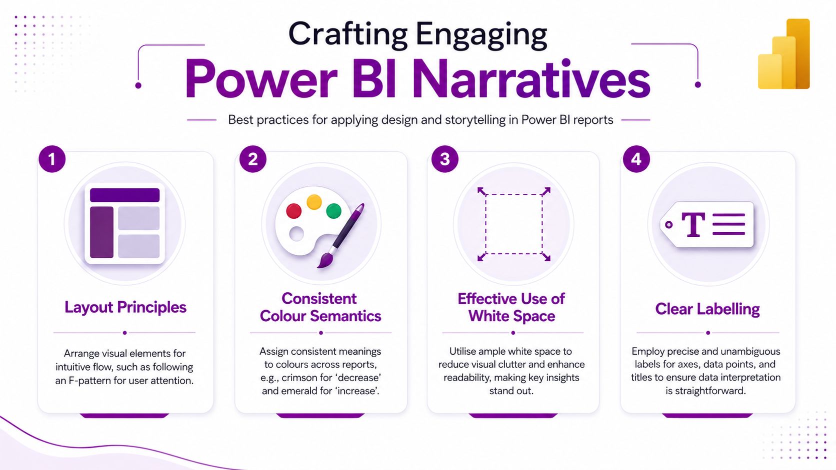
Layout, colour and labels
Start with layout. Put the most important visual where the eye lands first, then group related items together so the page has a clear reading order. Keep the page simple enough that a busy manager can scan it without stopping to decode the structure. Clear chart types, limited clutter, and colour choices that carry meaning all help mixed audiences understand the report quickly.
Colour needs discipline. If green means positive in one part of the report, do not make it mean something different elsewhere. That consistency helps users learn the language of the dashboard quickly, which matters for UK SME teams that may only open Power BI reports once or twice a week.
Labels deserve the same care. A chart can be visually polished and still fail if the axis names are vague, the legend is buried, or the annotation text competes with the data. Keep titles specific, say what changed rather than only naming the metric, and use white space so the important visual stands out. A clean page works like a tidy noticeboard, each item has a place, and the eye can move through it without friction.
Story layers without confusion
Bookmarks and drill-through act like chapter breaks. The first page gives the overview, then users can move to a deeper page when they need the supporting evidence. That approach works better than putting every detail on the front page, because it lets you control the pace of discovery and avoids overwhelming colleagues who only need the headline.
- Keep titles specific: say what changed, not just what the chart is.
- Use white space deliberately: empty space helps important visuals stand out.
- Label plainly: if a manager cannot understand the axis in three seconds, rewrite it.
- Avoid mixed chart styles: one page should feel like one idea, not four competing ones.
“If the user has to decode the page, the page is doing too much.”
Typography matters too. Use a small number of font sizes and keep them consistent across pages. Reports often fail at the point of use because labels are cramped, the legend is buried, or the annotation text fights the chart. That is hard on readers and harder still on accessibility, especially for teams that need clear contrast and simple structure to review figures with confidence.
Performance Optimisation and Data Preparation Tips
Fast reports begin before the first visual appears. If the model is messy, the dashboard will feel sluggish no matter how elegant the chart layout is. Essential work starts in data preparation, where you decide what to keep, what to summarise, and what to let Power BI calculate on demand.
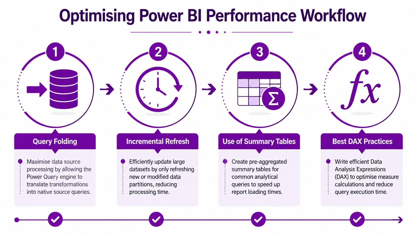
Build the model for the report, not against it
Start with clean source connections, then move through transformation, relationships, and measure design. If the data source can handle transformations directly, query folding keeps more work at the source, which is usually a cleaner pattern than dragging every step into the model layer. That keeps the report easier to maintain.
Then look at aggregation. Summary tables help when users repeatedly ask the same broad questions, because the report can answer them without grinding through every transaction row. For DAX, efficient measures matter just as much. Tight measure logic is easier to test, easier to explain, and less likely to surprise users later.
Refresh strategy and growth
Incremental refresh is useful when the data keeps growing and you don't want every update to behave like a full rebuild. It supports a more sensible pattern, refresh what changed, leave what didn't, and keep the report responsive for users who just want today's view. That matters in busy SME environments where reports are opened throughout the day, not once a month.
A simple workflow often works best:
- Connect carefully. Bring in only the data the report needs.
- Clean early. Standardise names, dates, and categories before the model grows.
- Shape relationships. Make sure tables connect in a way that matches the business question.
- Write measures efficiently. Keep calculations readable, testable, and reusable.
Power BI also supports a wider development ecosystem through Microsoft's broader platform, and organisations sometimes use specialist partners such as F1Group for report builds and model tuning alongside their own internal team. The important thing is not who does the work, it's that the model is designed to stay usable as reporting demands increase.
Accessibility and Governance Strategies
A report can look polished and still be hard to use if people cannot read it quickly or trust the numbers behind it. In a UK SME, that usually means the same dashboard has to work for finance, operations, and managers with different levels of technical confidence. Accessibility helps people read the story. Governance helps them trust it.
Microsoft's guidance supports that balance through clear chart types, consistent colour semantics, and limited slicers so mixed audiences, including people with colour-vision deficiencies, can understand the page quickly.
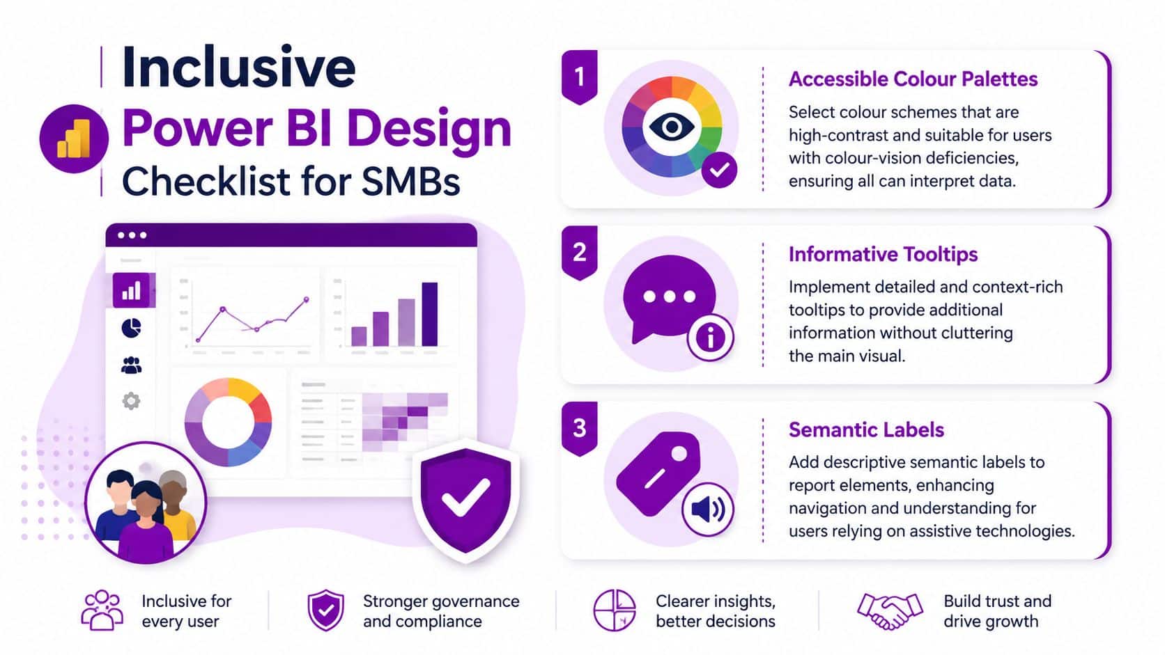
Make the report readable for everyone
Choose palettes that do not depend on colour alone. Use contrast, labels, and tooltips so users can understand the meaning even if a hue difference is missed. That matters in public-facing reports and charity reporting, where the audience is wider and less predictable than an internal analyst group.
Tooltips are one of the simplest ways to add context without crowding the page. They let the main visual stay clean while still giving users a place to inspect detail. Semantic labels help as well, because they make the report easier to use and easier to understand when assistive technologies are in use.
A useful check is to ask whether the report still works if someone reads it without colour. If the answer is no, the design needs another pass. Clear labelling, plain language, and a restrained layout usually solve more problems than extra decoration ever will.
Governance keeps the report trustworthy
A dashboard can look polished and still be risky if the data rules are unclear. Governance controls decide who can see what, which version of the dataset is trusted, and how the report fits into the wider workspace structure. That matters for SMEs handling sensitive operational or financial data, and it matters even more where reporting supports compliance or funding oversight.
Governance rule: if people cannot tell where a number came from, they will hesitate to use it.
Certification, row-level security, and workspace control all support confidence in the report environment. They do not make the visuals better on their own, but they make the visuals safer to use. For non-technical teams, that safety often translates into adoption, because users are more willing to rely on a report when they know the numbers are controlled.
Power BI also sits inside the wider Microsoft platform, so governance can be part of a broader workflow rather than an isolated admin task. Teams can use Power Platform integration guidance to connect reporting with related tools while keeping permissions and ownership clear. That is useful when one team builds the report, another team reviews the figures, and a third team needs to act on them.
Leveraging Integration with Power Platform and Copilot AI
A Power BI report becomes more useful when it sits inside the rest of Microsoft's platform instead of acting as a standalone island. Microsoft's broader Power Platform links reporting, app building, automation and AI, so a chart can lead to an action rather than just sit on a page. For readers who want the wider context, this Power Platform guide explains how the tools fit together.
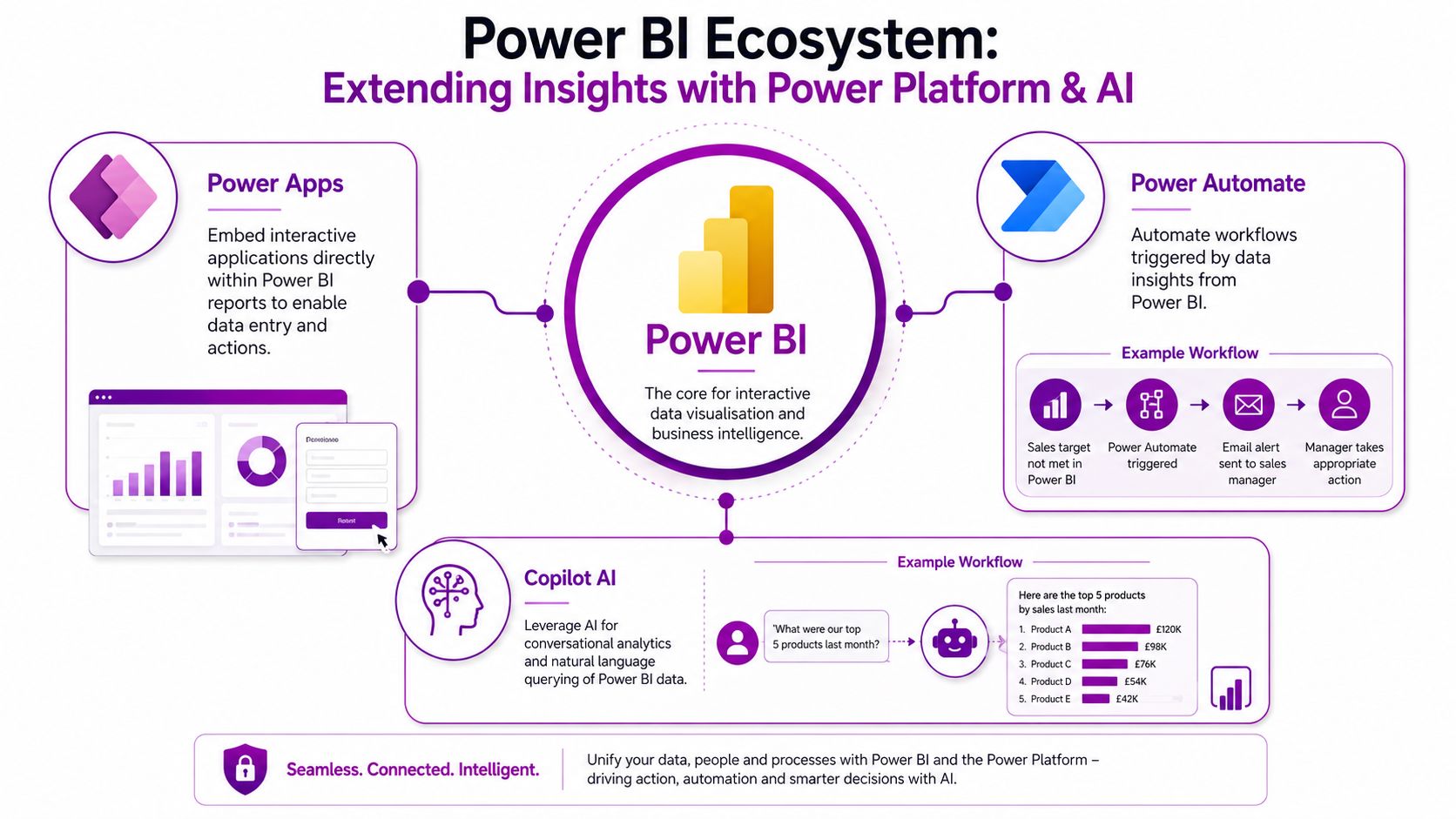
From insight to action
Power Automate helps when a metric needs a response. A report can surface a problem, then automation can alert the right person or start a workflow. That shortens the gap between seeing an issue and dealing with it, which is where a lot of operational friction usually sits.
Power Apps adds the action layer inside or alongside the report. Instead of emailing data back and forth, teams can record a correction, a status update or a follow-up task in a structured app. For field teams and mobile users, that keeps the reporting process tied to daily work.
Copilot AI changes the experience again by making the report more conversational. Rather than searching through slicers and visuals, a user can ask for a summary, a comparison, or a list of top performers and get a response grounded in the model. The visual layer still matters, but Copilot can make the data easier to approach for people who are less comfortable exploring it manually.
Where this matters for SMEs
This mix matters because it widens who can use the report and what they can do with it. A manager can read the visual, a team member can update a record, and a leader can ask for a plain-language summary without rebuilding the dashboard. The result is a connected reporting workflow that supports action, not just display.
Accessibility and governance matter here too. If a report is easy to read but hard to trust, or simple to query but awkward to maintain, adoption slows down quickly. UK SMEs often need reporting that works for different roles, keeps permissions clear, and still leaves room for non-technical users to interact with the data through Copilot and connected apps.
That combination is useful in smaller teams because one person may build the report, another may review the figures, and a third may act on them. Power BI works more like a control panel in that setup. The visuals show the position, the automation moves the work on, and the AI layer lowers the effort needed to ask the next question.
SMB Implementation and Use Cases
A sensible Power BI rollout starts with the business problem, not the chart library. In a Nottingham retailer, that might mean replacing scattered sales exports with a dashboard that helps the owner compare categories and store performance in one place. In a Lincoln charity, it could mean a financial report that shows income, spend and budget position without forcing staff to rebuild the same workbook every month.
The implementation pattern usually follows the same shape. First comes the needs assessment, where the team decides which decisions the report must support. Then comes data connection, followed by dashboard development, user training and ongoing support. That sequence keeps the technical build tied to real user behaviour, which is where many reporting projects either succeed or drift.
What the roadmap looks like in practice
A retail SME often wants a sales dashboard that can be read in seconds. The useful visuals there are usually compact, comparison-focused, and built around a few core measures. A manufacturing team may need operational metrics instead, with clear trend views, exception highlighting, and a drill path for investigating bottlenecks.
Charities tend to care about governance as much as layout. They need reporting that staff can trust, but they also need it to be understandable by trustees and non-specialists. That means the visuals have to do double duty, communicate the message and preserve the audit trail behind it.
- Needs assessment: agree the business questions before the build starts.
- Data connection: link the source systems cleanly and keep the scope tight.
- Dashboard development: choose visuals that answer the agreed questions fast.
- User training: show people how to read the report and use the filters.
- Ongoing support: refine the model as business needs change.
A report that fits the way people work will get used. A report that fights the workflow gets ignored.
For East Midlands SMEs, the main advantage is consistency. The same reporting discipline can be applied across sales, finance and operations, so managers don't have to learn a different language every time they open a new dashboard. That makes Power BI less like a one-off project and more like part of the organisation's operating rhythm.
Conclusion and Next Steps
Strong Power BI reporting starts with the right visual, but it only becomes useful when the page is clear, accessible and built on a model that performs well. UK SMEs get the most value when they treat visuals as decision tools, not decoration, and when they connect Power BI with the wider Power Platform and Copilot AI in a controlled way. If your current reports are hard to trust or hard to use, the fix is usually better design, better governance and better support.
F1Group helps East Midlands organisations plan Power BI reports, build governed dashboards and connect them to Microsoft tools that support day-to-day decision-making. If you want a clearer reporting setup for your team, visit F1Group, phone 0845 855 0000 today, and send us a message at https://www.f1group.com/contact/ to get started.